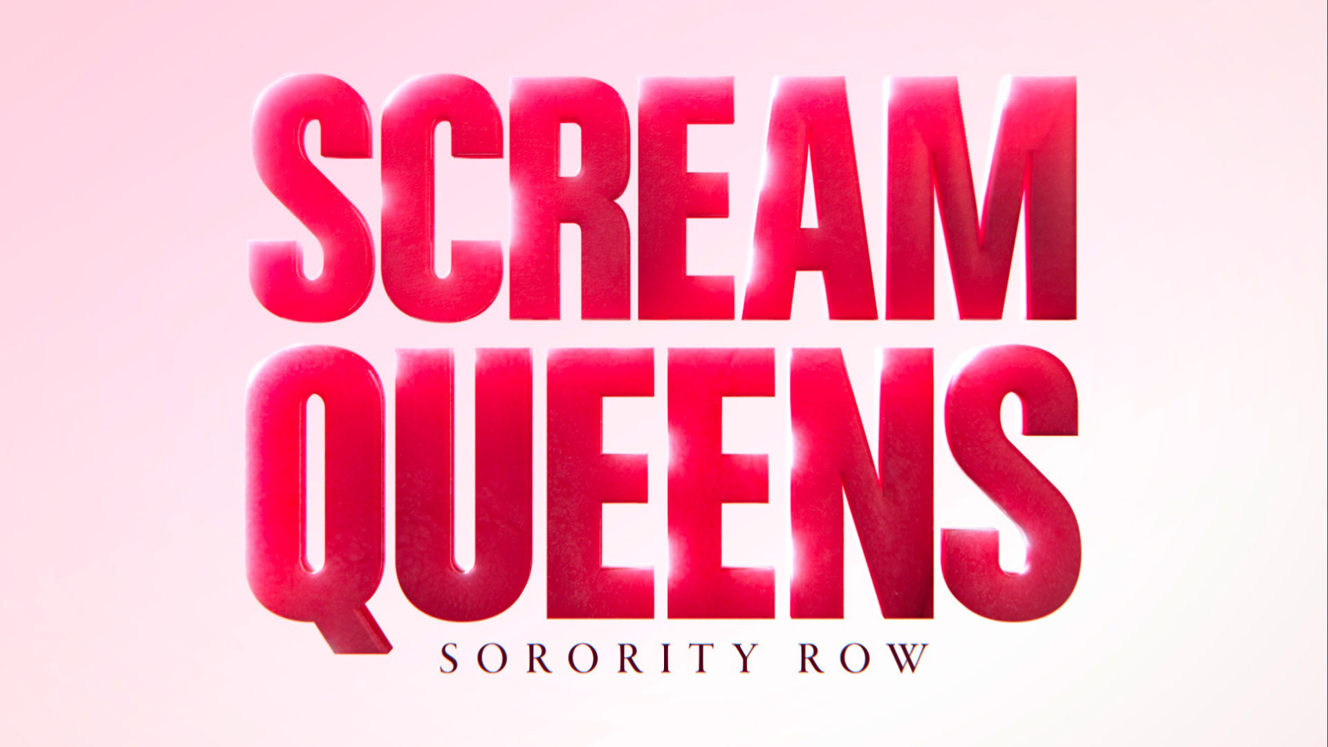
Another twisty road of development but so much fun to work on. The initial brief was to make something super-pop, light, pastel, stereotypical sorority, but with something off about it. I went for the bright tones but used subsurface scattering on the type to make it like a chunk of meat. A little bit of tongue texture on it and we're off to it!
Produced at FOX
Design Director: Ian MacRitchie
Design: Dan Pierse
![](https://cdn.myportfolio.com/7fa6031dc4394e41b61bb14f4b503ced/092accfa5234974733af360d_rw_1920.jpg?h=52174e54d5cc0cfdafac3b70a99b547f)
![](https://cdn.myportfolio.com/7fa6031dc4394e41b61bb14f4b503ced/d7bd240d91f67fc1c6b5c229_rw_1920.jpg?h=c038676901255fbf42907503946e2f47)
![](https://cdn.myportfolio.com/7fa6031dc4394e41b61bb14f4b503ced/d22e3ad35cb6346461032de2_rw_1920.jpg?h=67ac910c930d2e747a3f9500f8b054e8)
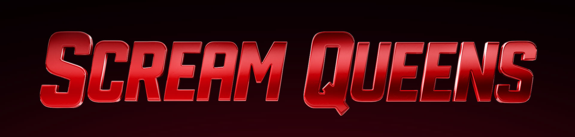
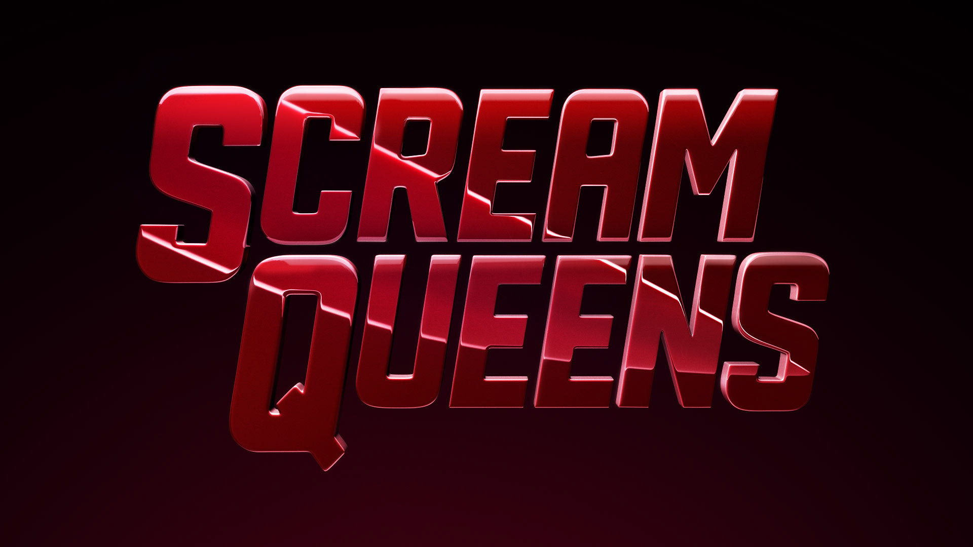
The direction needed to be reeled back so out went pastel and in came the menacing overtones.
![](https://cdn.myportfolio.com/7fa6031dc4394e41b61bb14f4b503ced/75e8d455aaac98b22f186cc4_rw_1920.jpg?h=4d959c38e6a543785cb936cf6f2f2253)
![](https://cdn.myportfolio.com/7fa6031dc4394e41b61bb14f4b503ced/f42f170a458818daa6d4e7f6_rw_1920.jpg?h=09a2b6c2e74a0a531e549d36f8b1ba83)
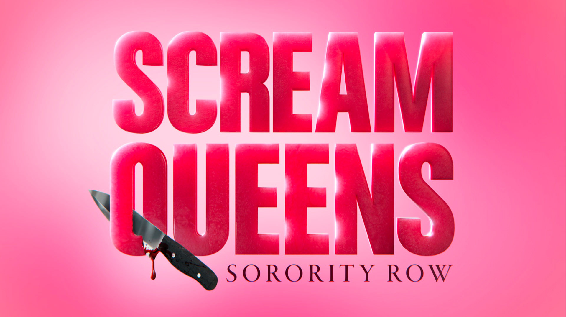
Below are what finally made it to the print division for their marketing purposes. For the motion side of things, there's been some great spots done by our team with a practical logo that was shot and comped. Check em' out!
Dance With The Devil (I designed and animated the mock "Squawker" UI)
![](https://cdn.myportfolio.com/7fa6031dc4394e41b61bb14f4b503ced/f048033f271af19fe492f60a_rw_1920.jpg?h=9d361634e5b386459dfb3613d701a81e)
![](https://cdn.myportfolio.com/7fa6031dc4394e41b61bb14f4b503ced/003e820e47b4d26361d424df_rw_1920.jpg?h=779175ac0f305a0641cc7e14e0c99f0e)